The early days of internet access were cumbersome, before broadband, you had to dial-up, which was expensive and a huge waste of time. Then came Web2 – the age of user-generated, participatory, and interactive websites. Web2 had some problems, mostly related to the influx of multinational corporations who saw the opportunity inherent in the two-way internet, developing platforms to collect user data — thus making users a product. But we can’t deny that Web2 does something amazing: it makes the Internet easy to use.
Web2 makes it possible for anyone in the world to access and interact with knowledge, resources, bank accounts, online courses, encyclopedias, social networks, side jobs, full-time jobs, inspiration, and therapy, a breakthrough in user adoption. The biggest players in the Web2 space are prioritizing user experience (UX), making the internet fun and easy, rather than a corner that confuses tech nerds.
The better the user experience, the more people in the world will embrace the web. A better user experience allows you to understand the entire website in a time-critical situation, especially in countries that rely on mobile phones – those without reliable internet connections, fast speeds, and laptops or computers – Web2’s simple mobile application Programs and well-laid websites are huge for open access, and this chart shows Internet adoption by country, with huge spikes in mobile phones and a better user experience with Web2.
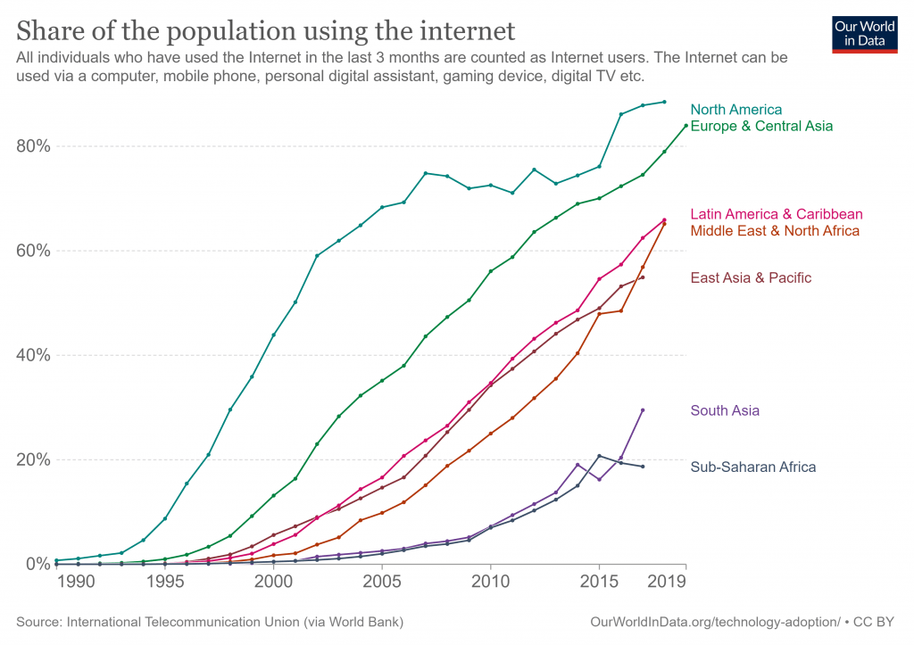
Now fast forward to 2022. I fear that in Web3, the internet of ownership enabled by cryptography and blockchain technology, we are going backward. If we throw away everything we’ve learned from the second-generation internet, including two decades of user experience insights, we won’t build a better internet for the world, we’ll build an internet for the rich — whatever Wealth in money, time, or education, we’re not here to build that.
The problem is, that Web3 wasn’t designed for everyday users, and it’s shaping up to be a tragedy.
I want the world to have decentralized financial tools, permission-less voting via smart contracts, and verifiable digital asset ownership. But if we need to realize that we are doing something irreversible and unnecessary: making internet access difficult again.
I’m not trying to attack the developers or tell anyone in Web3 that they’re not doing well. The reality is that we may need to go through these growing pains to get where we want to be — and Web1 has to go through those too. But right now Web3’s user experience is very poor, and the user experience tells a story — and right now, it’s not a good story. When I open an exchange app, the user experience tells me that I’m not a qualified trader and can’t use DeFi. When I tried to join a DAO and only saw a Discord link as my source of information, I felt maybe it wasn’t for me, and when I tried to buy that NFT, the UX told me the transaction failed — but didn’t say why the user experience is telling me that I’m not welcome. The user experience of Web3 is not designed for ordinary people these days. To move forward, we need to learn from the Web2 story: put user experience first.
Web2 succeeds because it puts user experience first
I think part of the reason we compare Web3 to Web1 so much is that both lack the key element that Web2 gets right: user experience. Web1 and Web3 are often referred to as the “Wild West,” where tech-savvy users roam all corners of the Internet on their own, with no roadmap and enough free time and money to devote to it.
Web2 was an internet renaissance for everyone, because of the user experience. Why did Apple succeed? They designed a personal computer for ordinary people, not for tech-savvy programmers. Why is Amazon successful? They built a platform based on user priorities, and they made it so easy for users to shop electronically with them. I fear that with Web3’s general distaste for Web2’s practices and principles, we’ve thrown away something of value along with corporate greed and platform monopoly. In throwing away these pesky things, we also accidentally throw away the consideration of the average user.
UX design is about empathy. It’s about putting yourself in other people’s shoes and designing products or experiences that enrich their lives. It’s about imagining when walking through an airport, where the flight status sign should be placed, where the bathroom sign should be hung. A photo editing program would make an “undo” button for those mistakes a user would make. A bill payment service will be created on the banking app to show the user safety and security, it’s all about empathy.
I worry that we are losing that empathy in Web3, we are not showing compassion and we are repeating over and over again “not financial advice”, “do your own research” and “I am not a lawyer” but People are never pointed in the right direction to find a financial advisor or do research or hire a lawyer. We tell people, “Be safe”, “Make sure you trust every contract before you sign it”, but don’t explain how a contract is safe, or how to know when to trust something in a so-called trustless system.
Also, we expect people to have the time and risk tolerance to self-custody their assets without empathy for those who cannot take that risk. We tell them to “figure it out” on their own. In this way, we let them have a rebellious mentality and go to the New York Times to provide material for the anti-cryptocurrency thought article.
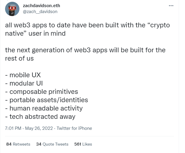
Web3 expects ordinary people to care about the tech stack that something is built on. It expects people to choose a “chain” and form a “tribe” around the “maximum” of this “chain”. Unless Web3 starts acknowledging real problems that people in the real world have to solve, it will stay on the fringes of tech idiots. We built ourselves a maze of steps and asked each user to navigate each step on their own. We’ve built a palace for those lucky enough to have the time and resources to invest in learning Web3, ignoring those who don’t have the time to figure out what a mnemonic phrase is. But it’s not irreversible, we can fix it, here are four key areas where Web3 needs a better user experience:
- How to get started
- How to get involved
- How to solve real problems in your real life (not through technology and philosophy)
- How to exit or backtrack
- How to get started
Let’s use a Web2 page as an example. I compared a bank to a decentralized exchange, and below is the home page of Bank of America. While the design can be a bit ugly, every page section is geared towards newcomers.

From “open an account” to “schedule an appointment” to a range of credit card products, there’s a link to click and a place to log in if you’re here for the first time. Even the search bar in the upper right corner helps you start from scratch, this page is designed for first-time users. Now, I’ll compare it to a basic DeFi page. They all looked similar, so I used a generic website.

What would you probably do if you were here for the first time? where will you go? How would you start?
Most of you are probably into the cryptocurrency industry like me. If you don’t have primary navigation, you have absolutely no idea what you are doing when landing on this generic DEX. We have emerging products to help solve this problem. For example, Rabbithole is a course that guides you through the rules and mechanics of Web3. Projects like this are great and I love that resources like this exist. But what if you had to take a course when trying to open a U.S. bank account? What if you had to learn a whole new dictionary of terms every time you tried to start something new in Web2?
Imagine you’re a busy parent with only half an hour between when your work ends and your child comes home from kindergarten. To solve your problem, need a place to move money, would you try Bank of America or DEX? Bank of America designed the app with the user in mind, they designed it to help parents with their money in half an hour, and they designed a good user experience, those are the things we need to think about in Web3.
People need clear pathways to get involved
People interested in Web3 also need a way to get involved and get jobs. But how do you get involved in a DAO? How do you get a job in cryptocurrency? Let’s take a look at starting work in a Web2 company with a DAO.
(Again, no company – neither Web2 nor Web3 is perfect. Most have major flaws. We ask these questions not to glorify the company, but to illustrate where improvements can be made).
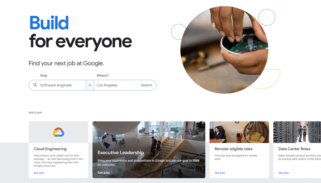
This Google page showcases a seamless, simple user experience, as you can simply enter the role and job title you want, the internet is incredibly easy in this case. In The DAO, there is no easy way to apply for a job, and Discord is full of jumbled links and information, which is what new entrants see after going through a brief verification process in BanklessDAO.
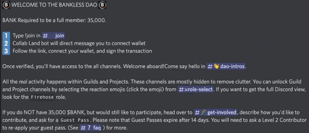
For the natives of Web3, you might read this and think: Simple, right? For the uninitiated, this is pure gibberish. BANK? Collab.Land? wallet? level 2?
We’ve been designing these systems without considering how an average, tech-savvy user would understand cumbersome information, that’s why Web3’s user adoption is growing so slowly, and that’s why DAOs struggle to attract and retain top Talent is also the reason we need to learn from Web2.
People need benefits and solutions, not technologies and ideas
One of the biggest problems in Web3 UX right now is the complete lack of interest-driven writing and design. Instead, everything is designed around technology and philosophy, with the hope that users will be willing to jump over a million hurdles in order to achieve “decentralization” that is still indefinable. Unfortunately, the average user may not be chasing “decentralization” as we think. Just like most people in the world don’t care if Netflix is built on AWS, most people in the world don’t care if Web3 Netflix is built on Ethereum or Solana or Cosmos.
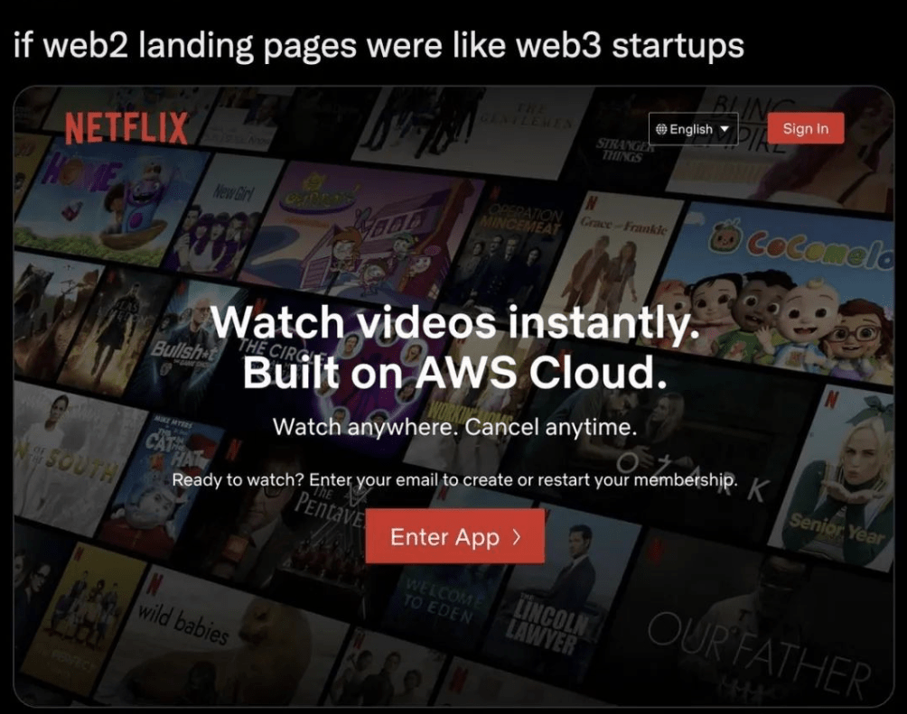
While the folks at Web3 might care about these things right now, if we’re going to reach mainstream adoption, we need to design for the rest of the world: not just our Crypto Twitter bubble. When designing a product, web page or recruiting process, we need to think more deeply about the problems people have and design solutions to those problems. Most people when trying to solve a problem don’t look for philosophies around decentralization or self-sovereignty, they look for a solution to the problem that needs to be quick, easy and simple to understand.
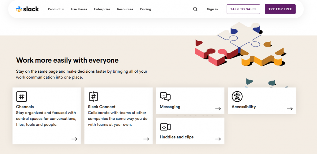
For example, see how Slack, one of Web2’s empires, makes its site present solutions rather than technology or philosophy. Slack shows you how you can “make decisions faster,” “stay organized,” and “work with teams at other companies.” It doesn’t tell you its philosophies about remote work and agile teams — although you can find them somewhere on the internet. But when it comes to attracting first-time users, it’s focused on how to make those users’ lives better.
Some Web3 products are marketed to the most advanced users for whom a different set of benefits and solutions can be used, which may involve a mix of technology and philosophy. But it is unreasonable for new users to care about what chain their application is built on or understand decentralization when they use the product for the first time.
For Web3 to go mainstream, we need to give people solutions, not philosophies.
One of the user experience’s main tenets is always providing an exit path. Unfortunately, blockchains have no exit route: transactions are irreversible. But that doesn’t mean we can’t provide solutions for those new users when things go wrong.
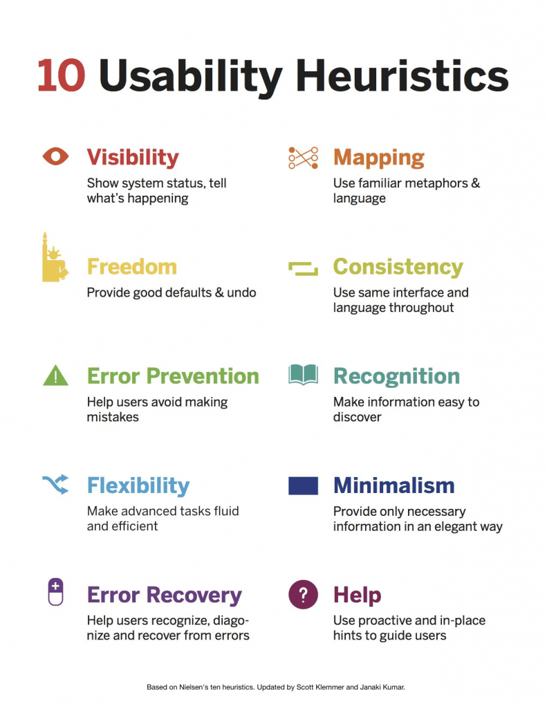
Web3 shouldn’t make it difficult for first-time users, nor should they feel lost about the transactions they’re doing , they should feel comfortable trying something without needing a knowledgeable peer to tell them how to do it.
If we don’t give users empathy by giving them an exit route (or explaining why there isn’t one), we’re losing the battle against Web2 user adoption.
Conclusion
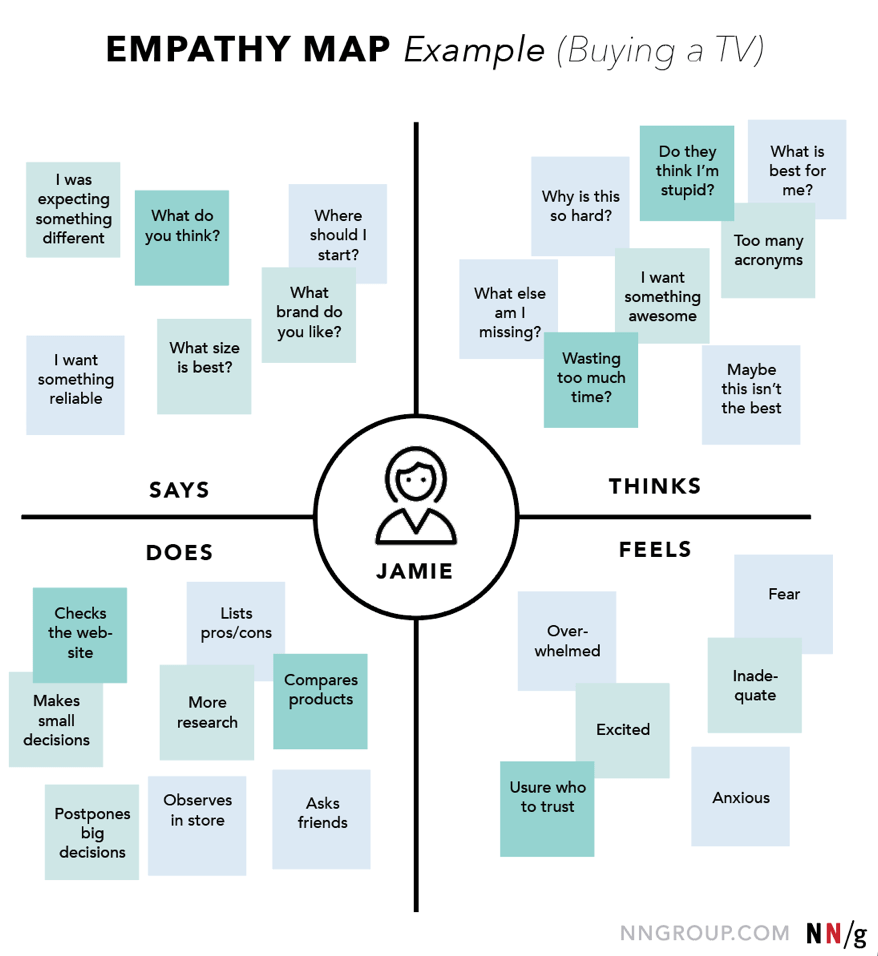
One way to do this is to make an empathy map, which is a way of identifying what a user says, feels, thinks, and does when performing an action, here’s an example of a buying TV user.
Creating an empathy map can help designers understand where users are when using their product, it can help us build exits when things go wrong, and provide information and tooltips.
It can help us design for real humans who make mistakes and have fears, doubts, and problems. Or we can go a step further and ask non-technical users to test our apps and products.
We can reach the general public and experiment with them. We can bring the principles of user research — testing products early and often with real users — into the development of Web3 products.
We don’t need to reinvent the wheel in Web3, we just need to make sure the wheel turns smoothly.
I’m here to build a better internet — not a more cumbersome internet.
In fact, we’re building an internet that’s easier to use than Web2, we’re building an internet where you can join a DAO and get a job without spending months learning a lot of redundant information in Discord channels. We build an internet where anyone in the world can exchange tokens and make payments without getting caught up in all sorts of barriers and legal constraints, and we want to build an internet that is truly fair to everyone.
Don’t blame yourself if you’re in any way confused when starting out with Web3, it’s a whole new world full of technical jargon and confusing applications. Web3 is a movement that needs more than philosophical ideas to inspire people; it needs to have real empathy for ordinary users, and it needs to resonate with people like you and me.


